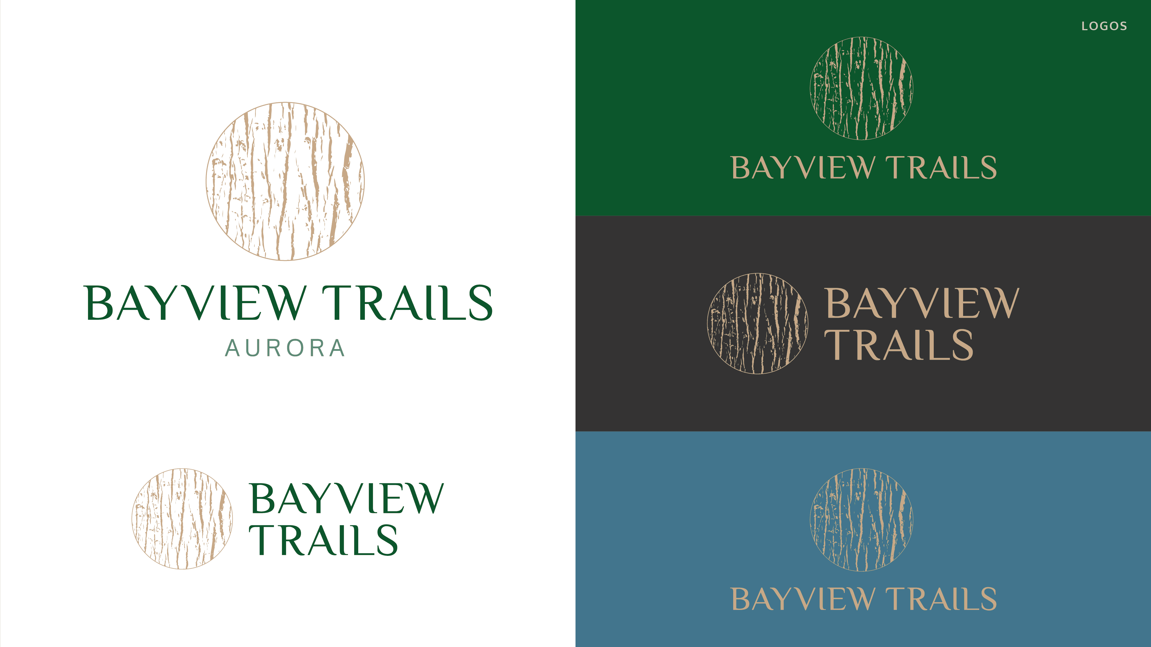
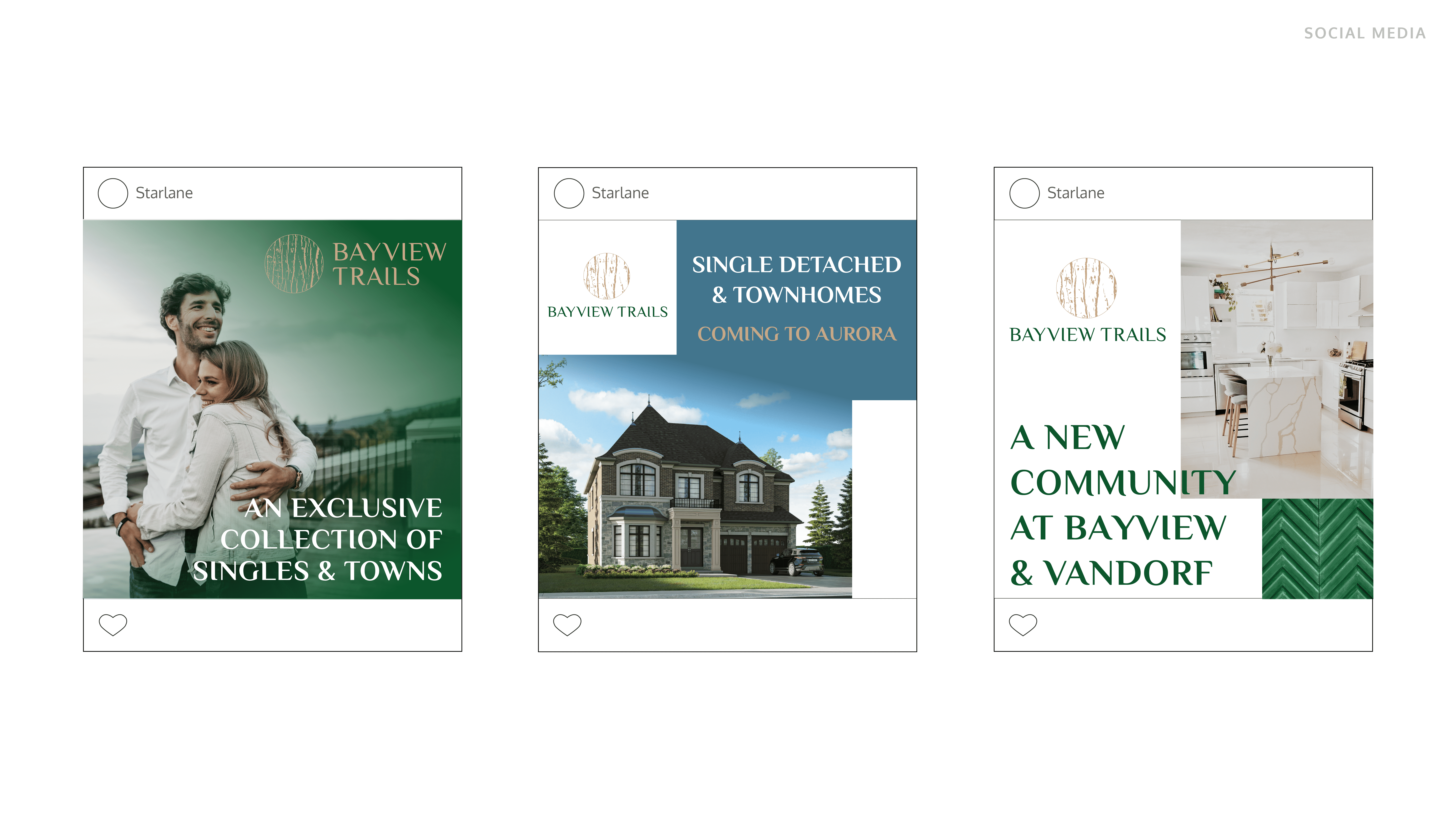
In this project case study, I will be sharing my experience designing the visual identity for Bayview Trails, an upcoming subdivision development in Aurora. The goal was to create a brand identity that captured the community’s balance of modern living and natural serenity, appealing to prospective homebuyers.
Throughout the process, I focused on developing a cohesive and memorable visual language, including a logo, color palette, and typography, to reflect the project's unique character and ensure a lasting impression.
Client
Starlane & Treasure Hill
Type
Visual Identity
Year
2023

Process
Breaking Down the Project
For Bayview Trails, the focus was on crafting a visual identity that would resonate with prospective homebuyers and reflect the community's natural charm. I started by researching the Aurora region, exploring themes of modern living and harmony with nature, and breaking the project into key deliverables.
Building a Foundation
The foundation of this project was rooted in conceptual sketches and mood boards to capture the essence of Bayview Trails. By blending inspirations from the subdivision's serene landscapes and the promise of modern suburban living, I established a design direction that would set the tone for a cohesive and appealing brand identity.
Tools Used
Adobe InDesign & Illustrator


